Design is Art After All
When I paint … I look at it and I say, “The space in that corner there needs a little blue,” and so I put my blue up there and then, then I look over there and it looks blue over there so I take my brush and I move it over there and I make it blue over there, too.
This quote, and the surrounding passage from The Philosophy of Andy Warhol, has stuck with me for years. When I first read it, it seemed to hint at a sort of intuitive artistic power that I couldn’t access yet — a certain way of viewing your own work that allowed the work to exist in conversation with you as a creator.
In the full excerpt, Warhol describes his process of moving the blue paintbrush around the canvas until everything feels right, doing the same thing with the green brush, taking a look, and deciding when the painting was done. On face value this description might make it seem like a painting was thoughtless or unplanned, but I think the truth is that these paintings were embodiments of a sort of learned instinct for composing images.
And, like Warhol’s paintings, type design illuminates a powerful method of intuitive composition that can be applied across design disciplines.

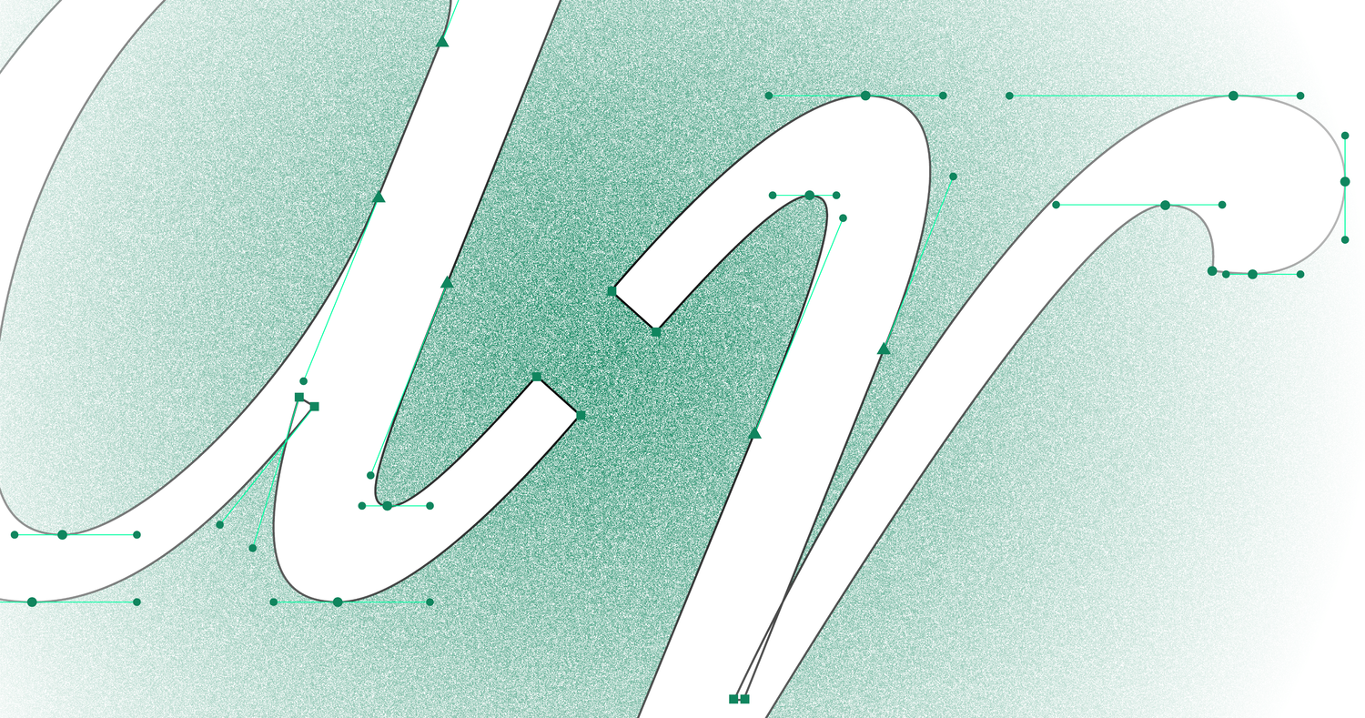
Still from Shields’ lecture
As part of the Type@Cooper program, students can attend guest lectures in the Herb Lubalin lecture series (archived on Vimeo). During one such lecture about wood type, speaker David Shields diverted into Rob Roy Kelly’s book A Collector’s Guide to Trivets & Stands, which thoroughly catalogued the utilitarian objects. Shields mentioned that trivet design is actually quite typographic in nature. And I wondered what the possible connection could be, before realizing that maybe it was about the composition of the trivets.
Still from Shields’ lecture
The same way I’m learning to balance counter shapes with strokes to create cogent and readable letterforms, someone designing a trivet would seek to balance air with iron, creating a cogent and usable platform for a hot dish.
Back in our studio sessions every Tuesday, I would bring my latest design proofs up to Hannes Famira for critique and guidance on where to go next. Hannes can see things I can’t in the letters. He can pick out a control point from across the room, and see a “lumpy” contour with his eyes closed.
Halfway through the term, I was saddled with two interesting themes. On one hand, the idea that the compositional rules of type (beyond the orthodoxies of cap/lowercase proportions, serif construction, etc) could be broadly applied to other types of design and creation. On the other hand, the idea that there’s an advanced compositional sight and instinct possessed by experts — an instinct I couldn’t yet access.
And certainly this isn’t a new idea. “Be good at balancing compositions” is not a groundbreaking development. But instead of simply saying “knowing how to compose is important,” I want to take both of these ideas, open them up, and integrate them into the practice of designing interfaces — the thing I’m best at, and to which I tend to relate every new idea.
What isn’t design?
In a recent interview I said something that I’ve thought for a long time but never said openly — all things that are created are art.
What I mean by this, at least partially, is that there’s probably no point in spending mental energy sorting things into columns of “art” and “not art.” I don’t want to say something is “not art” and then be on the hook for determining what is. But I also mean to say that we should think more about things as intentional creations that have their own intrinsic meaning and that communicate something from the creator to the person encountering them.
Yes, this means I think the Venn diagram of art and design is basically a circle.
The unspoken second half of this statement is that all things created with intention are designed. Yes, this means that I think art is designed and, yes, it also means I think the Venn diagram of art and design is basically a circle.
I think it’s tempting to think of art and design as entirely different concepts because design feels like it’s different—like it has different goals, different processes, and often a more systematic role in how products are made. In an episode of Design Notes that I recorded with Fictive Kin’s Cameron Koczon, he said the following:
…when I ran Brooklyn Beta, I saw a lot of attention on design and it became something that VCs were talking about, business leaders [saying], “you gotta have it. You gotta get yourself some design.” … “Design,” the word, is now everywhere. Good job the word “design.” But designers, the community — I don’t think they’re getting much from it and I don’t think that those of us on the receiving end of designed products are getting much from it.
Koczon’s point (which is fully detailed in An Important Time for Design) is that the idea of design, particularly in tech, became sacred, and — adding my own interpretation — that the word itself became a sort of empty container into which we could pack our own strongly-held beliefs and ideals, often about the things we want or hope for. The practical result of this, according to Koczon, was not an elevation of the designers creating these new sacred objects, just of the word and the idea of the practice.
I think understanding that perspective, and giving myself permission to step back from the narrative that design is somehow an elevated mode of operation, allowed me to see that perhaps there was room to challenge other orthodoxies of design in tech, or at least to introduce new ideas to the conversation.
I already want to challenge our conception of interfaces as static or terminal creations by allowing them to live with users, but maybe right now, in the present, while we’re still dealing with interfaces that don’t adapt at that level, we can let down our guard around the concept of what design is (it’s a lot of things) and start to borrow again from the intuitive practices of disciplines like type design to inform and invigorate our work.
Learning to intuit
Something I had to unlearn when I started learning type design was the instinct to rely on numbers. Stem widths and spacing metrics called to me as opportunities for a strong system. I should be able to figure out the right values and apply them evenly across every glyph, right? Wrong. So, so wrong.
Many elements of type design are created and adjusted optically, and while the notion of a system is strong in type, the system seems to act more as a collection of concepts than a collection of immutable components. Mapping the optics and systems I know from interface design to type design consistently creates conflict in the letterforms. And to break out of this instinct I had to learn to intuit. To do that, I needed a new perspective.
Negative is the new positive
In a weekend-long workshop about letter proportions lead by John Downer, I found that perspective. Downer told us something that really started to change how I viewed the things I was creating.
He said to think of letterforms not as discrete objects lying on a background, but rather forms constrained by—shaped by—the background. That the counters in and around the letters were really what we were shaping, not the letters themselves. We should clean up a pool of ink, not create one.

And this stuck with me. Not just because it had a major impact on how I understand spacing in type, or how I perceive letters in relationship to the background and to each other, but because it also has broad applicability to interfaces.
One of the most common criticisms I read of contemporary interfaces, particularly on the web or large screens—but certainly with more fervor on smaller screens where space is precious—is that there’s too much white space. This negative space is often called “wasted,” or “unused,” or “empty,” but if we look at it the way Downer sees type, we can evaluate whether white space and wasted space are truly the same thing. And I think the answer might be surprising.
Negative space gives form and meaning to the positive space it contains
Negative space, at its best, gives form and meaning to the positive space it contains. Viewing it this way, we can give that space specific Gestalt duties — it can create or eliminate proximity, continuity, or closure. When negative space isn’t employed to these ends, you feel it. The interface, the typeface—the design—doesn’t quite work. More than a simple exchange of screen space-for-information, we should think about and evaluate use of space on these qualitative terms.
A collection of concepts
I’m not someone who likes to say “the best ___ I know do ___,” so indulge me when I say that the best design systems I know aren’t restrictive.
One of the major criticisms of interface design’s current systematic renaissance is that the design systems we create and share are too restrictive for designers, stifling of expression, extension, and the intuition I want to advocate for in this post. This was certainly a sentiment we heard about the early iterations of Material Design at Google. And to that end, Material has evolved. In 2018, the notion of Material Theming imbued the system with a broad set of subsystems and parameters that allow designers to maintain the fundamental concepts and usability of Material while creating a unique and expressive system.
A baseline 4dp corner radius, for example, does not mean that all shaped components will have 4dp corners — corners can vary based on things like the size of a component, its relative importance in the interface, or even the action a user is taking at the moment when they encounter it. They can be modified and made asymmetric to couch or emphasize actions. The shape system in Material has solid internal logic, but maintains a strong degree of expressive range.
When I designed Wakehurst, it came out more like a fern in a greenhouse than one in the woods.
And the internal logic of a typeface works the same way. Rather than having a set menu of components that we brick together into a whole, elements can be extended, explored, and redefined to form a cohesive but dynamic family of shapes.

When I designed Wakehurst (the typeface pictured above), I interpreted my reference text with organic, leafy terminals that evoked the growth of a fern, but that were contained in a rational, structured set of glyphs. It came out more like a fern in a greenhouse than one in the woods, growing organically inside a rigid structure rather than existing among other organic forms. Looking at the top of the a as it relates to the j, the y, the &, the c, and other characters you can see the variation.
A typeface’s system, in other words, functions as a slightly looser conceptual theme. A related but biologically distinct group of plants took root in Wakehurst, and can also take root in your design system.
In interface design, these new botanic specimens often spring up in response to new or changing needs or environments. Different soil, different rainfall and sunlight. Perhaps a foraging creature has come along and nibbled on your button components. Have I pushed this metaphor too far?
Extension, exploration, and evolution are critical to a system’s longevity.
Allow design to express itself
If we return to Material Design, and think about it in the context of a large organization where a given theme may be propagated to various teams of designers for implementation in their own specific products, it’s easy to see how even this highly expressive and stylized version of Material we’ve created can begin to feel claustrophobic. When confronted with an exhaustive stickersheet like the one generated by Material Theme Editor, it’s easy to perceive highly expanded choice as a set of boundaries.
I would offer that, in fact, this breadth of stylized components provides the minimum ingredients necessary to create a diverse and expressive range of products using the same theme. I know this because we’ve put it into practice with Google Material, the theme my colleagues at Google created to help give Google apps the richly expressive properties of theming and bring the Google brand to life across products and platforms.

Google News, Google Home, and Gmail
Functioning like many design systems, Google Material has its set of components as well as a set of principles and guidelines for the type of extension, expression, and evolution discussed earlier. And while the sorts of components and interactions the system provides are highly expressive of a very specific brand, teams have done a brilliant job of bringing apps like Google Home, Tasks, Calendar, Keep, and Gmail to life with Google Material in a way that still allows each to maintain a core personality and experience.

In the same way that Wakehurst uses stroke terminals to delineate different types of glyphs—for instance lending leafy edges to the $ to differentiate it from the S—carefully selecting, composing, and extending components of a bounded system can create interesting and dynamic personalities for related interfaces.
Harnessing intuition
The truth is that—as humans—we all bring something with us to the design process. The accumulation of our experiences, interactions, tastes, beliefs, and biases, are all revealed in our work. The things we create are naturally extensions of ourselves. And while it’s important to be able to emotionally detach from our work, it’s impossible not to see in it our own reflection.
Intuitive composition can feel volatile.
As an engineer, writing code to accomplish the same task on two different days will probably yield different code. As a type designer, I manage files carefully because I could never make exactly the same precise optical curve adjustments twice.
Intuitive composition can feel volatile. The lack of exact, infallible rules feels like a risk.
The key is to use intuitive powers with intent.
That our work naturally lends itself to containing pieces of our individual lives is — first and foremost — why it’s important to work with other people across a wide range of perspectives, backgrounds, and experiences as a designer. But it’s also why harnessing the things that make up our instincts and intuition is crucial to creating an intuitive composition that remains compassionate, thoughtful, and of course usable.
The key is to use these intuitive powers with intent.
Warhol’s make-it-blue-over-there painting technique functioned with the intent of balancing a composition for mass production.
Viewing typographic glyphs not as solid objects but as shapes bounded by the spaces they occupy functions with the intent of creating readable, comprehensible text.
Shaping components by their size, elevation, and importance functions with the intent of building strong mental models for a complex interface.
The goals of these examples may be different, but the process, the human qualities of the systems at work, and the instincts we build around that, are more similar than we may acknowledge.
So in the very same ways that art is not without design, I close by contending that design should not be without art.