The Design Notes Visual Identity

If you’ve followed me for a while you might know that the Design Notes podcast began as a side project, recorded from my apartment after work with guests from around the world. It was a long-format show usually pushing an hour in length, with very light editing and a loosely defined identity that changed with every guest. Aspects of the identity like music were things I didn’t have the time or budget to perfect, so some components of the show existed only because they had to. Still, making the show was fun and I wanted to keep it going because I knew there was still a lot to learn from folks in other fields working on other projects.
In Spring 2017 I joined Google and — as one of my first projects — I began working with teams from Google Design and Google’s content studio in New York to bring Design Notes back to life as a Google Design Podcast.
In its previous incarnation, I featured guests from Google as often as I could — many of my listeners were interested to hear how Googlers thought about design and what they were up to. But in bringing the podcast to Google Design, we decided to focus on those in creative fields outside Google, opening us up to a much broader range of disciplines and ensuring that Design Notes could offer something really unique and somewhat more focused in its mission to inspire designers by examining how folks in other fields approach the considerations we all have to make. Like the opening says, we want to discover “what inspires and unites us in our practice;” how designing furniture, clothing, generative identities, games, toys, roads, and language learning platforms is all related, and what we can learn from each to apply to our daily work.
As we continued to flesh out what the show would be, we also began working on the show’s identity, both visible and audible. Anthony Zukovsky, working from a pile of inspirational snippets and samples and the concepts I wanted to keep core to the identity, came up with the initial concept that’s now become a full system — the simple circle and square becoming the D and N of Design Notes.

One of the biggest components I wanted to keep in the identity was its flexibility. It was important that the identity could not only adapt to the various promotional assets we would need later, but also that it could adopt various textures, materials, colors, and images to describe or allude to each guest’s work. Still there had to be something foundational that made it feel like a cohesive system. We found that in basic shapes and typography.
In this post, I want to unpack the core components of the Design Notes identity, the assets it’s used to create, and how we can use this system to adapt imagery across those assets.
The core components
Shape
In silhouette, the Design Notes logo (and all its branded assets) looks like a rectangle with the upper right corner curved to almost 50% of the shape’s total height.

Inside that base shape, we distinguish two surfaces. One, the D shape, a solid color with text on top. The other, the N shape, with imagery.
This basic configuration extends and contracts to create a range of branded assets for each episode which listeners, viewers, and readers can see across podcast players, YouTube videos, and show articles.
To cover 3:2, 2:1, 1:1, and 16:9 aspect ratios, the silhouette of the DN logo extends horizontally, maintaining the proportions of the clipped corner and the D shape at every size.
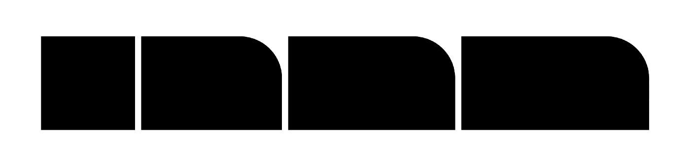
Even if the artwork supports it, however, you’ll never see a DN asset at longer than a 2:1 aspect ratio. At longer sizes, the relationship between the D and the N shapes becomes too tenuous, and the imagery starts to draw too much focus in the composition.

Ok, you’ll see it once - right here.
Where possible, I also try to allow the imagery to complement the shape. In the case of DN07 above, the mountain of furniture at the far right of the frame follows our rounded corner nicely.
The consistently-sized D shape makes a convenient container for short strings of text broken into two lines, but inevitably some episode titles are too long and must overflow. In this situation, text (usually the second line) is allowed to overflow onto the N shape, provided there’s enough contrast in the imagery to support it.
This is a problem we allowed ourselves to face early on with the Material Design Awards episode.

Typography
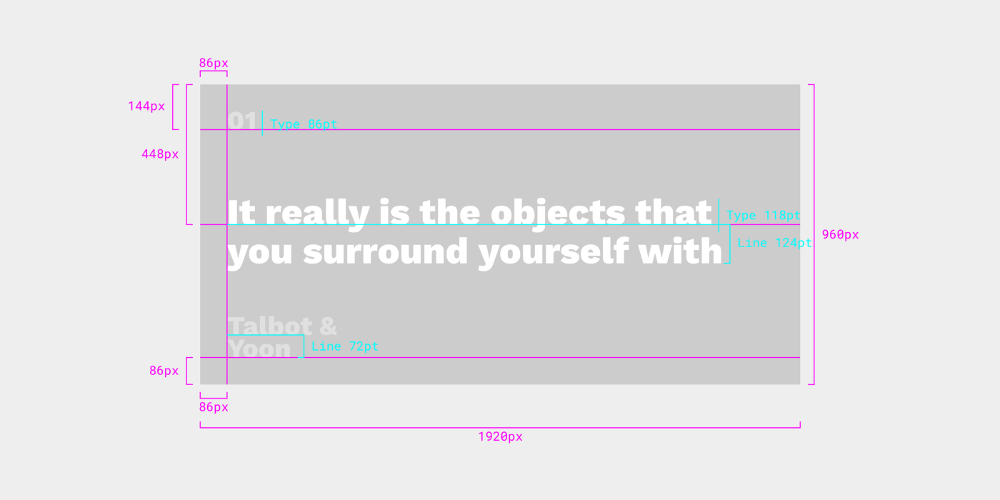
The Design Notes identity relies on Work Sans Extra Bold, almost always set in one or two white lines.
Because the Design Notes assets need to adapt to multiple different sizes and aspect ratios, I needed to come up with a way of maintaining proportion and optical spacing across assets.

The Design Notes art uses a line-height value that isn’t standard to Work Sans, allowing the descenders of the top line to nestle snugly into the ascenders of the bottom line. I wanted to establish a consistent relationship between the character size and line height, so after measuring this relationship on the initial assets we created, I adjusted the type to get the line height to roughly 85% of the value of the character size. As I worked my way down from the largest assets to the smallest, adjustments were made to clean up each value while maintaining the optical relationship.

This means that for the largest assets — the cover art and 3x2 hero image — the type is set at 300pt with a 256pt line height. The next size down is 224/192, and the scale continues to 200/170 and 116/98. But of course because this scale is determined solely by the relationship between character size and line height, it means that it could extend to other sizes in the future.
When setting text for Design Notes, this relationship flips — the line height becomes 1.05x the character size to increase balance and readability in wider layouts. This relationship is primarily used in Design Notes’ social assets, where we highlight quotes from the show.
Speaking of these social assets, they required a non-standard text treatment of their own. For each asset, the episode number and title are shown throughout the video, but I wanted to deemphasize this information compared to the quote itself. Doing this uniformly as the background changed from episode to episode required an overlay treatment. So each episode’s metadata in the social asset is set to 40% opacity. This ensured that it would be less visible than the quoted text (which is 100% opacity white) but still appear with a consistent relationship to the background color, whatever it happened to be.
Color
Design Notes art typically uses a simple three-color palette for each episode. The first color is white, used for text on each asset. The other two colors are extracted from the imagery that appears inside the “N” side of the artwork.
One of these extracted colors is the primary color — this is the color that fills in the “D” side. There are three primary goals for the primary color:
Be unique
Complement the artwork
Ensure readability
The first goal, standing out, is pretty simple. There is no defined palette for the Design Notes artwork, just a loose guideline to avoid repetition and preserve as much contrast as possible with the text (the third goal). Since there is no preset palette, there are a lot of directions the primary color could go.
To figure out what color to use, I typically sample several swatches from the artwork in the “N” side, and test them across a template file I’ve set up to cover all the main assets we use for the show. I like to pull out tones that feel like an accent to the artwork, rather than simply pulling the dominant color.

One exception to this approach is the SPAN 2017 series of interviews, recorded by guest host Aaron Lammer in Pittsburgh during Google’s annual design conference.

Early explorations of co-branding with SPAN’s identity
For this series of four episodes, we chose to co-brand the art with aspects of the SPAN identity. Specifically, we drew from a palette of color combinations, and switched to strictly photographic content for the cover art, using portraits of each guest.

To fully realize the color pairings established by the SPAN identity, I gave the images a subtle treatment , blending a gradient on top of each with the complementary color from the SPAN palette. These complementary colors replaced — in the SPAN series — the second sampled color I mentioned above: the secondary color.
It’s rare to see secondary colors used actively in Design Notes artwork. Usually they provide subtle image treatments, or they might be used to back assets like the Cue Card that require higher contrast. They can belong to the same family as the primary color, or they can strike a contrast, depending on each color’s prominence in the overall artwork.
The assets we might choose to use for each episode can be unpredictable, so this approach to color allows the DN artwork to easily adapt to whatever it’s given.
Imagery
Outside of special cases like the SPAN series of episodes, Design Notes art typically uses textural, abstract, or re-contextualized imagery to fill in the “N” side. The idea is that the art should stand on its own but that — after hearing the episode — the listener can return to it and find new meaning.
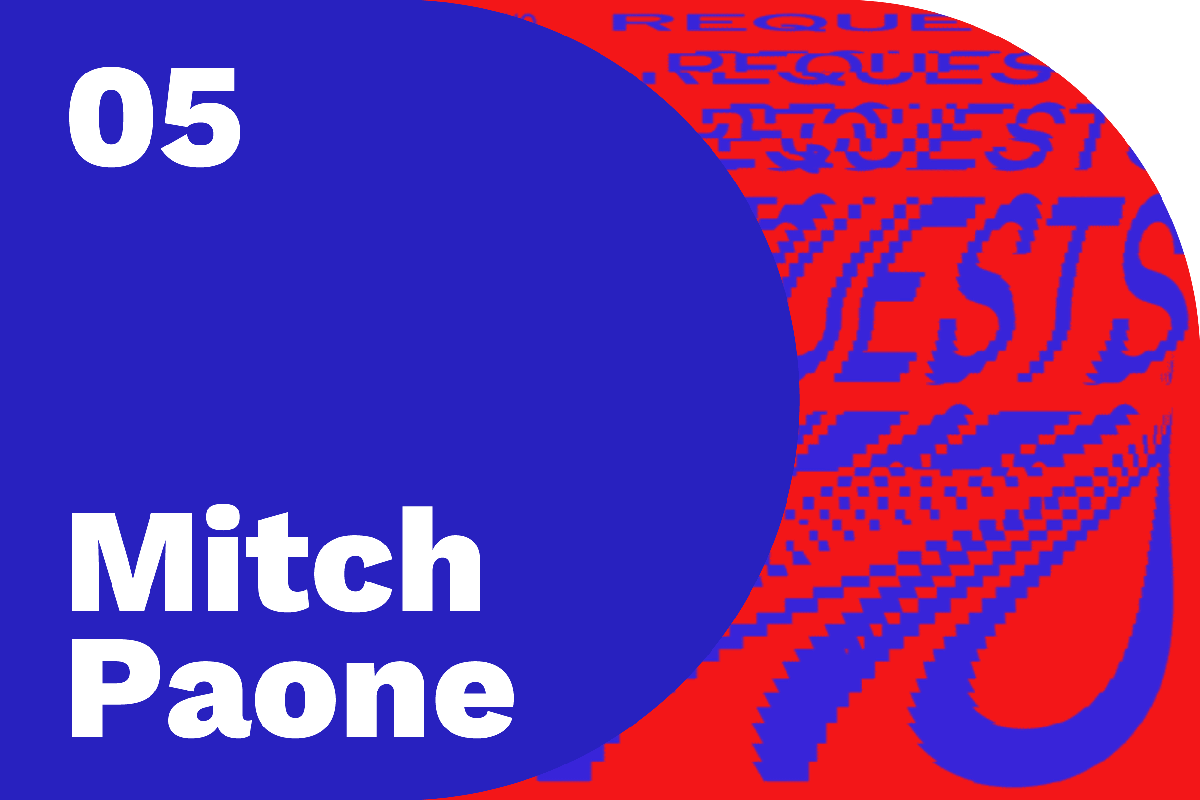
The episode with Mitch Paone of Dia studio, for example, uses a cropped version of a text animation that says “no requests.” In the interview, we learn that Dia produces kinetic identities. The studio created this specific sample for Canadian DJ A-Trak to use in stage displays.

The art for Design Notes’ premier episode, with New York-based design duo Mark Talbot & Youngjin Yoon, shows us a closeup of a grate pattern. During the interview, we learn that this is their experimental soap dish, crafted as a miniature tetrahedral waffle slab, inspired by architectural components used in Louis Kahn’s design of the Yale University Art Gallery.
In this way, the Design Notes art is designed not only to give the full spotlight to each guest and their work, but to provide ongoing — and changing — meaning as you experience each episode.
Putting it all together
All of these elements come together to create the various assets we need to publish an episode. These are divided into four primary asset types: Podcast, Article, YouTube, and Social.
Podcast assets
The only real asset in the Podcast category is the square logo and its customized counterparts for each episode. Podcast platforms like iTunes or Play Music use the square logo to represent the show, while some platforms — like Pocket Casts — allow listeners to see custom artwork for each episode.

So while the majority of listeners will never see the customized square art, it’s a nice touch for those who do.
This asset establishes many of the patterns reflected in the other assets — a consistent left keyline aligns the episode number and name, and the same measurement is used to place the bottom baseline. That measurement also loosely determines the placement of the episode number, in that generally the top of the cap height of the episode number should be the same distance from the top as the bottom baseline of the episode name is from the bottom.
Article assets
There are three primary article assets needed for each episode of Design Notes, and they’re all variations on the D+Extended N discussed earlier.

The first is the 2x1 Hero, which shows up on the front page of design.google when each episode is initially published.
The 3x2 Hero, meanwhile, appears in the general feed when the article isn’t being featured.

The 3x2 Hero uses the same 128px base measurement from the square logo, and this measurement is scaled down proportionally for the 2x1 Hero which has a smaller height. Similarly the type is scaled down according to the approach discussed above.
There’s also an even smaller asset — the Share asset. This asset is what shows up when someone embeds or links the article on a social platform like Twitter, G+, or Facebook.

The base measurement and typography scale down again, along with the length of the “N” side of the shape.
YouTube assets
The YouTube thumbnail is stylistically and systematically very similar to the Article assets, except that it has a non-transparent background.

Typically the background for thumbnails is white, to prevent YouTube from filling in the transparent area with another color or adding artifacts to the curve of the “N.” The asset is a normal 1080p resolution to match the video.

Initially, I experimented with applying the secondary color to the background of the YouTube thumbnail, but making the background white instead results in a more compelling asset — having what appears to be a rounded corner on a thumbnail surrounded by rectangles allows us to “break” the repetition of the thumbnail grid and in some small way subvert YouTube’s standard layout.
Social assets
Occasionally, we create additional assets to promote an episode on Twitter. I call these Cue Cards. They don’t feature the “D” or “N” shapes — instead they’re just cards with backgrounds colored to match the primary color of the episode, and a snippet of text from the episode.
The type style follows the body style outlined above, meaning it has larger line heights than the DN artwork to improve readability, and the name and episode number are both given a translucent treatment so they can fade into the background and avoid distracting from the main text.
…And the transcript
Finally — not belonging to any of the above categories — there are specs for the Design Notes transcripts, too. Each episode, we release a full transcript of the interview to accommodate reading or listening. Since these are text-based PDFs, it’s important that they maintain a consistent layout and style so the reader knows what to expect and can get straight to the content.

A simplified type scale separates metadata from content, and generous horizontal spacing lets you know who’s talking while keeping that info distinct from what they’re saying.
Establishing a flexible identity system for Design Notes has helped me refine my approach to creating self-contained but adaptable systems. But it’s also reinforced and reemphasized the goal of the show: highlighting, examining, and — most importantly — learning from those working on other types of design, and finding those aspects of their practice that we can integrate with our own.
You can keep up with Design Notes at design.google/podcasts and subscribe on Google Play, iTunes, Pocket Casts, Spotify, Deezer, RSS, or wherever you listen to podcasts.